Monday, June 28, 2010

Pie chart

A pie chart (or a circle graph) is a circular chart divided into sectors, illustrating proportion. In a pie chart, the arc length of each sector (and consequently its central angle and area), is proportional to the quantity it represents. When angles are measured with 1 turn as unit then a number of percent is identified with the same number of centiturns. Together, the sectors create a full disk. It is named for its resemblance to a pie which has been sliced. The earliest known pie chart is generally credited to William Playfair's Statistical Breviary of 1801.[1][2]
The pie chart is perhaps the most ubiquitous statistical chart in the business world and the mass media.[3] However, it has been criticized,[4] and some recommend avoiding it[5][6][7], pointing out in particular that it is difficult to compare different sections of a given pie chart, or to compare data across different pie charts. Pie charts can be an effective way of displaying information in some cases, in particular if the intent is to compare the size of a slice with the whole pie, rather than comparing the slices among them.[1] Pie charts work particularly well when the slices represent 25 to 50% of the data,[8] but in general, other plots such as the bar chart or the dot plot, or non-graphical methods such as tables, may be more adapted for representing certain information.

Use, effectiveness and visual perception
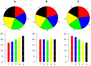
Three sets of data plotted using pie charts and bar charts.
Pie charts are common in business and journalism, perhaps because they are perceived as being less "geeky" than other types of graph. However statisticians generally regard pie charts as a poor method of displaying information, and they are uncommon in scientific literature. One reason is that it is more difficult for comparisons to be made between the size of items in a chart when area is used instead of length and when different items are shown as different shapes. Stevens' power law states that visual area is perceived with a power of 0.7, compared to a power of 1.0 for length. This suggests that length is a better scale to use, since perceived differences would be linearly related to actual differences.
Further, in research performed at AT&T Bell Laboratories, it was shown that comparison by angle was less accurate than comparison by length. This can be illustrated with the diagram to the right, showing three pie charts, and, below each of them, the corresponding bar chart representing the same data. Most subjects have difficulty ordering the slices in the pie chart by size; when the bar chart is used the comparison is much easier.[9]. Similarly, comparisons between data sets are easier using the bar chart. However, if the goal is to compare a given category (a slice of the pie) with the total (the whole pie) in a single chart and the multiple is close to 25 or 50 percent, then a pie chart can often be more effective than a bar graph.

Variants and similar charts

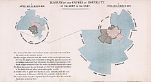
"Diagram of the causes of mortality in the army in the East" by Florence Nightingale.

Polar area pie chart

Florence Nightingale is credited with developing a form of the pie chart now known as the polar area diagram, though there are earlier uses. André-Michel Guerry invented the "rose diagram" form, used in an 1829 paper showing frequency of events for cyclic phenomena.[citation needed] Léon Lalanne later used a polar diagram to show the frequency of wind directions around compass points in 1843. The wind rose is still used by meteorologists. The polar area diagram is similar to a usual pie chart, except that the sectors are equal angles and differ rather in how far each sector extends from the center of the circle, enabling multiple comparisons on one diagram.
Nightingale published her rose diagram in 1858. The name "coxcomb" is sometimes used erroneously. This was the name Nightingale used to refer to a book containing the diagrams rather than the diagrams themselves.[10] It has been suggested [by whom?] that most of Nightingale's early reputation was built on her ability to give clear and concise presentations of data.

Multi-level pie chart

Ring chart of Linux file system
Multi-level pie chart, also known as a radial tree chart is used to visualize hierarchical data, depicted by concentric circles.[11] The circle in the centre represents the root node, with the hierarchy moving outward from the center. A segment of the inner circle bears a hierarchical relationship to those segments of the outer circle which lie within the angular sweep of the parent segment.[12]

Exploded pie chart

A chart with one or more sectors separated from the rest of the disk is known as an exploded pie chart. This effect is used to either highlight a sector, or to highlight smaller segments of the chart with small proportions.

3-D pie chart

A perspective (3D) pie chart is used to give the chart a 3D look. Often used for aesthetic reasons, the third dimension does not improve the reading of the data; on the contrary, these plots are difficult to interpret because of the distorted effect of perspective associated with the third dimension. The use of superfluous dimensions not used to display the data of interest is discouraged for charts in general, not only for pie charts

No comments:

Post a Comment

Problems of Non-Covid Patients and Health Care Services during Pandemic Period: A Micro level Study with reference to Chennai City, Tamilnadu

  https://www.eurchembull.com/uploads/paper/92a2223312e11453a5559262c1cd4542.pdf ABSTRACT Background: COVID-19 has disrupted India's eco...